CDG 2
CDG 2 places an ink note beside florals, resins and woods. Wearer accounts describe a brighter opening that settles into a calmer base, offering one way to experience the brand's theme of light and shadow.
#515 · 2026-10-16
Fragrance Overview and First Impression
Ink appears on the official note list for CDG 2. Magnolia, incense, amber, patchouli, vetiver and cedarwood are there too, so the idea reaches beyond a single cool or dry impression. The fragrance places a subject that sounds unusual beside flowers, resins and woods. That combination gives the first encounter more to consider than the word ink alone suggests.
The brand describes CDG 2 through reflection and opacity, mirrors and brilliance, light and shadow. It does not assign individual notes to one side of those pairs. The contrast is a way to understand the fragrance as a whole: a bright or soft impression can share space with something firmer and darker.
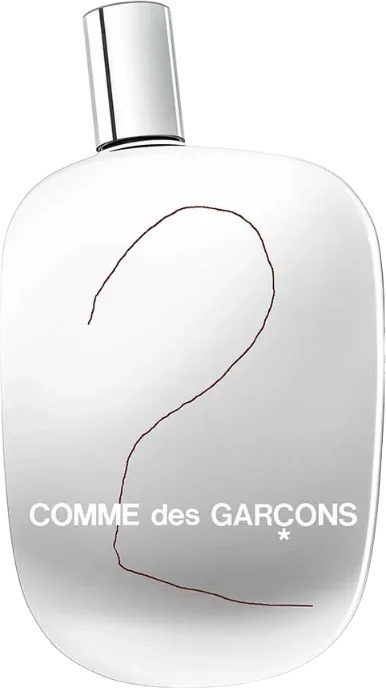
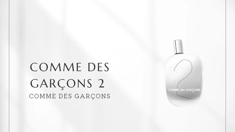
Several independent descriptions connect the perfume with Japanese calligraphy ink. Ink is an official note name, but that name does not establish that writing ink is an ingredient. It suits someone who wants a daytime fragrance with a dry coolness and the calm of incense rather than strong sweetness. The bottle has also been described as silver and mirror like. Its reflective appearance offers another point of entry into the brand's language of opposites.
Perfumer, Brand and Creative Background
COMME des GARÇONS was founded by Rei Kawakubo, who at first said there would be no perfume. Adrian Joffe, Kawakubo's husband and CEO of Comme des Garçons International, argued that fragrance could become a new way to express the brand's world, and the first perfume followed in 1994. Now called the Original, that eau de parfum came with a bottle, packaging and press release designed by Kawakubo. CDG 2 was the second fragrance to follow.
Christian Astuguevieille served as creative director of its fragrance line. In an interview, he described exploring opposing elements with Kawakubo and passing concise concepts to perfumers. That account explains a broader working method; it does not document a specific instruction given for CDG 2.
Several independent fragrance references credit Mark Buxton as the perfumer of CDG 2. The official product page does not name a perfumer. For the fragrance's stated creative idea, the clearest source remains the brand's own language of contrast and its note list. The same description also speaks of the earth and the energy of the sun, so words that suggest nature sit beside the artificial impressions of ink and mirrors.
The connection with Japanese calligraphy ink adds context, while the precise technical account of capturing that smell appears in only one source. The fragrance itself offers more than an ink impression. Aldehydes, flowers, incense and woods give that starting idea different textures as it develops.
The 1990s were also a time when Japanese designers brought new ideas to perfume. In 1992, designer Issey Miyake launched L'Eau d'Issey, the first Issey Miyake fragrance, proposing a transparent scent built around water when heavy, sweet perfumes were the norm. COMME des GARÇONS developed the idea of an anti perfume with Astuguevieille, and in 1998 released a fragrance that took inorganic smells such as metal and rock as its subject. Rather than composing a pleasant floral scent, it turned the smells of things not usually made into perfume, such as metal and rock, into fragrance, and that was what made it new at the time. CDG 2, inspired by Japanese calligraphy ink and bringing ink into fragrance, belongs to the same current.
The bottle is described as a silver, mirror like object, and some references credit Kawakubo and Marc Atlan with its design. A heart shaped package was made for the 2005 Love Hurts project and, according to later reporting, returned in 2025. That story concerns packaging; it does not establish a change to the perfume's formula.
Scent Analysis
The official site presents the notes as one list and does not prescribe their order on skin. A third party pyramid places aldehydes, angelica, mandarin orange and maté at the top, along with a leafy infusion note. One wearer also described a metallic aldehydic and citrus opening. That brighter start may surprise someone expecting ink to make the fragrance dark from the first spray.
Aldehydes can supply a brisk, metallic edge. Maté and that infusion note suggest the dryness of leaves, while mandarin orange brings a lighter citrus impression. These are useful things to look for when testing, though the pyramid is an editorial classification rather than an official timetable of how the fragrance must unfold.
The same pyramid places ink, magnolia, nutmeg, West Indian bay, coriander, caraway and cinnamon in the middle. Ink's drier character meets the softness of magnolia and the warmth of spices. The result need not feel like either a straightforward floral or a literal recreation of ink. Several textures can be present at once.
Incense, patchouli, vetiver, cedar, amber and labdanum appear in the pyramid's base. Woods and resins give the later impression a calmer weight than the opening. A wearer's account likewise describes woods, incense and earthy vetiver becoming apparent after the brighter start.
Ink, magnolia, incense and vetiver also occur on the official flat note list. Their placement into top, middle and base belongs to the third party pyramid. Following the movement from brightness through flowers and spice toward wood and resin is more useful than asking any one material to stand for light or shadow.
Comparisons and Positioning
Odeur 71, from the same brand, also uses the language of ink. It takes subjects from modern daily life, including fountain pen ink and the toner of a warm photocopier. CDG 2 puts ink beside flowers, resins and woods, then frames the fragrance through light and shadow. Someone drawn to everyday artificial smells may prefer the former idea; someone interested in ink meeting floral and woody materials has a reason to try CDG 2.
Byredo's Mixed Emotions shares a maté reference with CDG 2. Mixed Emotions centers on blackcurrant, Ceylon black tea and violet leaf. Around CDG 2's maté are ink, incense and aldehydes. Both offer a route in through tea, but one moves toward fruit and black tea while the other places tea within a sharper contrast of ink and resin.
Le Labo's THÉ NOIR 29 shares vetiver and cedarwood with CDG 2. It pairs black tea with fig and bergamot and has been described through a dry leaf and tobacco like finish. CDG 2 also brings ink, magnolia, aldehydes and maté into the picture. A preference for fruit with black tea points in one direction; an interest in flowers and ink beside woody tea facets points in the other.
These comparisons make CDG 2's range easier to grasp. Ink draws attention, yet flowers, tea, spices, resins and woods all have a part. Testing which of those materials stays most noticeable on skin is a practical way to decide whether its unusual opening leads somewhere appealing.
Buying Guide
The official listing shows a 100 mL eau de toilette and 50 mL and 100 mL eau de parfum options. Since both concentrations appear in a 100 mL size, check the concentration on the product rather than relying on volume alone. The available material does not settle their formula differences, scent differences or order of release. If both can be sampled, comparing them on skin is the soundest way to choose.
At a counter, allow time beyond the first aldehydic or citrus impression. The editorial pyramid suggests ink and magnolia in the middle and incense and woods later on. Some wearers find the ink cool and dry or the aldehydes strong. Waiting for the floral and woody aspects gives a fairer sense of whether those contrasts suit your taste.
Prices and availability vary by region, shop, concentration and size. Check the current official listing before buying. The 50 mL eau de parfum is the smaller officially listed option for someone considering portability. The label, the concentration and the scent after it settles are all more useful checks than the bottle's appearance alone.
Wearing Experience and Occasions
Wearer responses favor spring and autumn, and daytime more than evening. A spring or autumn day is therefore a sensible first setting for a test. A weekend outing or a workplace where fragrance is welcome gives enough time to notice its movement. A light jacket in spring or a knit in autumn fits those ordinary daytime settings.
Some wearers enjoy the meeting of ink and aldehydes and the way the impression changes over time. Others find the ink cold and dry or notice the aldehydes more strongly. Those differences make the name ink a poor shortcut for deciding whether the fragrance will appeal. Give the flowers and woods time to emerge on skin.
Moderate projection is a common description in wearer accounts. For time spent close to other people, the amount applied can be adjusted to the setting. On a hot day, it is useful to check how the cool ink and bright aldehydes feel before making it a regular choice. Perceived longevity can vary with skin and concentration.
CDG 2 begins with an unusual idea and continues through flowers, resins and woods. Its appeal becomes clearest when the bright opening and quieter later phase are both experienced. How the ink sits among those other notes on your own skin is the strongest reason to choose it.